Cross-browser styling of input type="file" using CSS.
This plugin allows you to style with using CSS the following HTML elements:
- checkbox ;
- switch ;
- field for selecting a file.
- field for entering numbers.
- drop-down list ;
Live examples can be viewed on a separate page. It is worth noting that not a single image was used when designing the form elements, only CSS.
Advantages- General:
- Easy design using CSS.
- When JavaScript is disabled, the following are displayed: standard elements forms, i.e. their performance is not lost.
- Pseudo-elements are displayed inline, i.e. repeat the properties of standard elements.
- Support for working with dynamically added/changed elements.
- Support for checked, selected, disabled attributes.
- The class , id , data-* , title attributes specified on the original form elements are passed to the corresponding pseudo-elements (id is passed with a suffix to avoid duplication).
- Support for dynamically adding/changing attributes class , id , data-* , title .
- Support for resetting the form when clicking on .
- It can “catch” pressing the Tab key and allows you to switch elements from the keyboard.
- Cross-browser compatibility (all modern browsers, as well as IE8 and higher).
- HTML5 validation support.
- Multilingual support.
- Supports the multiple attribute, i.e. allows you to select several items (multi-select).
- Supports grouping of list elements in select (tag).
- Allows you to set the maximum height for the drop-down list (using the max-height CSS property, or via the selectVisibleOptions option).
- Supports “smart positioning”, i.e. doesn't go away visible part pages when opening the list.
- Support for searching by single select items.
- Support for placeholder text.
- Automatically adjusts the width if it is not specified.
- Supports mouse wheel scrolling.
For selects:
When using some non-standard fonts (for example, Open Sans connected with Google Fonts), the width of the pseudo-select is incorrectly determined, and therefore the text of the items is cut off. This is due to the fact that the font is applied only after the select is styled by the plugin. As an option to solve this problem, you can delay the launch of the script:
setTimeout(function() ( $("input, select").styler(); ), 100)
Another solution is to use , which reinitializes the plugin after the font has finished loading.
- On Mac OS, when you switch the keyboard select, a native drop-down list appears.
For the plugin to work, you must use jQuery version 1.7.0 or later.
Connect jQuery (if it's not already connected), plugin and styles to it by adding following lines before the tag:
The jquery.formstyler.css file is the required styles needed for correct operation plugin, and jquery.formstyler.theme.css - visual design of form elements.
To activate the plugin, apply the .styler method to the tags you want to style:
(function($) ( $(function() ( $("input, select").styler(); )); ))(jQuery);
Disabling a plugin (destroy method)If there is a need to unlink a plugin from a styled element, then use the destroy method:
$("select").styler("destroy");
Dynamic changeAt dynamic change form elements need to fire a refresh trigger, for example:
$("button").click(function(e) ( e.preventDefault(); /* make the checkbox inactive */ $("input:checkbox").attr("disabled", true) /* update the state of the pseudo-checkbox * / .trigger("refresh" ));
When using third party plugins, such as jQuery Validation, that change the attributes of form elements, the .trigger("refresh") event must be fired using setTimeout, otherwise the state of the pseudo-elements will not change. Example with the above plugin:
$("form").validate(( invalidHandler: function() ( setTimeout(function() ( $("input, select").trigger("refresh"); ), 1) ) );
Plugin optionsMost plugin options can be overridden for a specific tag by specifying the corresponding data attribute.
| idSuffix | -styler | suffix to the id attribute passed from the element being styled | |
| filePlaceholder | File not selected | default text in the file selection field (when no file is selected) | data-placeholder |
| fileBrowse | Review... | text of the button next to the file selection field | data-browse |
| fileNumber | Selected files: %s | text after selecting several files, a number will be inserted instead of %s | data-number |
| selectPlaceholder | Select... | replacement text (placeholder) in a single select; is displayed if the first item with missing text is selected by default: | data-placeholder |
| selectSearch | false | show the search field in a single select (true - yes, false - no) | data-search |
| selectSearchLimit | 10 | minimum number of single select items at which to show search | data-search-limit |
| selectSearchNotFound | No matches found | message text stating that there are no items matching the search | data-search-not-found |
| selectSearchPlaceholder | Search... | default text in search field | data-search-placeholder |
| selectVisibleOptions | 0 | number of list items displayed in a simple select without scrolling | data-visible-options |
| selectSmartPositioning | true | smart positioning for select dropdown list: true - works up and down false - only works downwards "-1" - positioning disabled | data-smart-positioning |
| locale | ru | current locale | |
| locales | English localization | an array of locales with translations of the corresponding options, see more details |
Usage example:
$("input, select").styler(( fileBrowse: "Select", singleSelectzIndex: "999", onSelectOpened: function() ( // a red outline is added to the open select $(this).css("outline", " 3px solid red"); ) ));
LocalizationThe plugin supports multi-languages. The locale and locales options are used for this.
Localization example (English is included in the plugin by default):
$("input, select").styler(( locale: "en", locales: ( "en": ( filePlaceholder: "No file selected", fileBrowse: "Browse...", fileNumber: "Selected files: % s", selectPlaceholder: "Select...", selectSearchNotFound: "No matches found", selectSearchPlaceholder: "Search..." ) ), ));
CSS selectors used for styling| .jq-checkbox | default checkbox |
| .jq-checkbox__div | additional subtag |
| .jq-checkbox.checked | selected checkbox |
| .jq-checkbox.disabled | inactive (not selectable) checkbox |
| .jq-checkbox.focused | focus on checkbox when pressed Tab key |
| .jq-checkbox span | additional subtag |
| .jq-radio | default radio button |
| .jq-radio__div | additional subtag |
| .jq-radio.checked | selected radio button |
| .jq-radio.disabled | inactive (not selectable) radio button |
| .jq-radio.focused | focus on radio button when Tab key is pressed |
| .jq-radio span | additional subtag |
| .jq-file | parent container |
| .jq-file.focused | focus on the field |
| .jq-file.changed | file selected |
| .jq-file.disabled | inactive field |
| .jq-file__name | file name field |
| .jq-file__browse | file select button |
| .jq-number | parent container |
| .jq-number.focused | focus on the field |
| .jq-number.disabled | inactive field |
| .jq-number__field | wrapper for input field |
| .jq-number__spin.minus | minus button |
| .jq-number__spin.plus | plus button |
| .jq-selectbox | parent container |
| .jq-selectbox.opened | select dropdown list expanded |
| .jq-selectbox.dropup | select dropdown list expanded to top |
| .jq-selectbox.dropdown | select dropdown list expanded downwards |
| .jq-selectbox.changed | a value other than the default is selected |
| .jq-selectbox__select | select in collapsed state |
| .focused .jq-selectbox__select | focus on select when Tab key is pressed |
| .disabled .jq-selectbox__select | |
| .jq-selectbox__select-text | additional subtag for collapsed select |
| .jq-selectbox .placeholder | alt text |
| .jq-selectbox__trigger | right side of the collapsed select (conditional switch) |
| .jq-selectbox__trigger-arrow | subtag for radio button (arrow) |
| .jq-selectbox__dropdown | wrapper for dropdown list |
| .jq-selectbox__search | wrapper for search field |
| .jq-selectbox__search input | search field |
| .jq-selectbox__not-found | message about no search results |
| .jq-selectboxul | drop-down list |
| .jq-selectbox li | select item (option) |
| .jq-selectbox li.selected | selected select item |
| .jq-selectbox li.disabled | |
| .jq-selectbox li.optgroup | heading for a group of items |
| .jq-selectbox li.option | list item in group |
| .jq-select-multiple | parent container |
| .jq-select-multiple.disabled | inactive (not selectable) selector |
| .jq-select-multiple li | select item (option) |
| .jq-select-multiple li.selected | selected select item |
| .jq-select-multiple li.disabled | inactive (not available for selection) select item |
| .jq-select-multiple li.optgroup | heading for a group of items |
| .jq-select-multiple li.option | list item in group |
| .styler | class used to style text fields and buttons (works independently of the plugin) |
By 1998, when CSS Level 2 was released, form elements were already supported by all major browsers. The CSS 2 specification did not address the presentation problem. Since these elements are part of the user interface, the authors of the specification chose to leave their visual representation to browser developers.
Year after year, the insufficiently detailed specification forced web developers to experiment in attempts to bring the presentation of elements such as input , select , fieldset , legend and textarea in different browsers to a “common denominator”. In this article, we'll look at some CSS techniques used by web developers to standardize the visual presentation of form elements.
Tests by Roger JohanssonFirst in 2004 and then in 2007, Roger Johansson created a comprehensive set of tests to test the application of CSS styles to form elements. The results of these tests, which you can find in his article “On Styling Form Elements with CSS,” resulted in a disappointing conclusion, which Johansson expressed in the following words:
So what does this experiment show? As I said, it shows that using CSS for styling form elements in order to bring them to a single look in different browsers and on different platforms impossible. It also shows that most browsers ignore many CSS properties applied to form elements.
Despite the undoubted validity of these conclusions, web developers continued to actively test the application of CSS styles to form elements in order to find the Holy Grail of their cross-browser presentation, or at least a reasonable compromise between the styles applied by the browser by default and those specified by the developer.
Default modelThe CSS 2.1 specification specifies in its proposed default style sheet for HTML4 that form elements such as textarea , input , and select are inline-block:
textarea , input , select ( display : inline-block; )In turn, the form and fieldset elements are block-level:
fieldset, form (display: block;)The description of the default model proposed by the CSS specification is limited to this. All other visual aspects of form elements depend on the browser's default style sheet. However, the rules listed mean the following:
Inline block elements can be styled using the inline model. It allows you to use CSS properties such as line-height and vertical-align to control the height of a block and its vertical alignment. In addition, to indicate external and padding block can be applied margin properties and padding. Inline block elements support width and height because they use the block formatting model.
Block elements can be styled using the well-known block model. However, problems arise with the fieldset and legend elements, since legend is entirely dependent on the browser's default styles.
How do web developers solve these problems?
DimensionsWeb developers quickly noticed that browsers behaved strangely when used inline block elements when it comes to explicitly specifying dimensions. Specifying a height often leads to unexpected results:
input, select (width: 120px; height: 32px;)The developers tried to solve this problem by turning these elements into block elements:
input, select (width: 120px; height: 32px; display: block;)Only worked with textarea . Standard solutions this problem is to use instead height properties font-size and padding.
Form elements do not inherit the typeface and font size, so the first thing you need to do is specify them:
input , select ( width : 120px ; font : 1em Arial, sans-serif; )After defining the typeface, you can set padding to add padding to the element block:
input , select ( width : 120px ; font : 1em Arial, sans-serif; padding : 3px 6px ; )The input and textarea elements have a border defined in browser style sheets. Let's normalize it:
input , input , textarea ( border : 1px solid #ccc ; )Browsers add extra padding to input elements of type button and submit. A common practice for normalizing them is:
input, input (padding: 2px;)The problem with this technique is that browsers, among other things, apply browser-specific properties to these elements, and padding is not always able to normalize them. For example, in browsers using the Webkit engine, you may find the following:
input , input , input , input ::-webkit-file-upload-button , button ( -webkit-box-align : center; text-align : center; cursor : default; color : buttontext; padding : 2px 6px 3px ; border : 2px outset buttonface; border-image: initial; background-color: buttonface; box-sizing: border-box; input (-webkit-appearance: push-button; white-space: pre;)padding is also used for fieldset and legend elements, but produces different results:
- Setting the padding property of a fieldset element to 0 by default will reset the padding of the legend element in some browsers (but not IE).
- Setting the padding property of the legend element to 0 will cause it to collapse.
For select , and for input with checkbox and radio types, you should only use:
- font-family
- font-size
- width (for select),
- padding.
Applying other properties to these elements often leads to inconsistent results in different browsers.
AlignmentForm elements can be aligned horizontally and vertically. They can be located on one line or as a group of blocks below each other. To align them on the same line, you can use one of two approaches:
When float is used, elements automatically become block elements. This means that these form elements are now subject to the nine float element rules.
Form elements can be aligned vertically and horizontally.
When using float, the main problem is the correct vertical alignment relative to current line. This is usually done using margin or padding:
input , select ( width : 120px ; float : left ; margin-top : 0.4em ; )This approach works when you don't need to set the alignment of blocks relative to text, such as the contents of a label . In case this is necessary, you can use relative positioning, padding and margin on elements containing only text:
label ( float : left; padding-top : 0.4em ; width : 5em ; margin-right : 1em ; )Another problem arises with the buttons. In the case where you have a button that is larger than other elements, you can set its vertical alignment using relative positioning:
input ( float : left; width : 90px ; position : relative; top : 0.4em ; )Another technique with relative positioning can be used for input with checkbox and radio types. Relative positioning can even be used to normalize the left padding of a legend element within a fieldset element. The only difference is that you need to use the left property instead of the top property.
When using the inline and inline-box model, you can use the vertical-align property to vertically align elements:
label , input ( vertical-align : middle; margin-right : 1em ; )It can be convenient to use this property together with line-height . It is important to note that you must apply this property to the parent element. If you apply this property directly to form elements, it will have an effect when calculating their height:
.form-row ( line-height : 1.4 ; )Specifying the parent element's height explicitly is also effective when used in conjunction with an equal row-height value:
.form-row (line-height: 1.8; height: 1.8em;)When using the line or line-block model, you can also use text-align property for the parent element to align elements right, left, or center.
Strange features of file selection elements- This a special case. For security reasons, this type of element should always be visible and recognizable in the browser. This means that browsers deliberately ignore some styles (for example, styles related to the visibility of an element) and tend to enforce the presentation described by their own style sheets.
It's worth noting that the default layout varies between browsers: some browsers only show one button, while others add a text field to indicate the path to the downloaded file.
Web developers, however, quickly found a way to overcome these limitations. First they put the input field in a container:
They then hid the input element with opacity properties and applied styles to the container:
.upload ( width : 157px ; height : 57px ; background : url (upload.png) no-repeat; overflow : hidden; ) .upload input ( display : block !important ; width : 157px !important ; height : 57px !important ; opacity : 0 !important ; overflow : hidden!important )Note the!important . This is the preferred method for overriding default browser styles.
ConclusionFull control over the presentation of form elements is not possible due to the lack of certainty in the CSS specification and due to the default styles applied by browsers. However, using some common techniques, you can reduce (but not eliminate) differences in the design of elements.
Original article: The Problem Of CSS Form Elements Article read by: , visitorFM , Anton Khlynovskiy , Igor Adamenko
3.9 out of 5
Hello. Today I want to tell you about how you can change appearance file input, how to style an input file to suit your design, how to style .
Enough keywords=). I think you get the point.
The fact is that changing the appearance of inputs, as a rule, does not cause difficulties, but this type of input is different from the others. First of all, this is due to security, and secondly, to the fact that each browser displays this element differently, and this is almost impossible to influence.
This article will tell you how to achieve the appearance of the input file that you need.
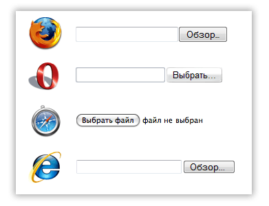
First, let's look at how file inputs are displayed without applying any styles in different browsers.
As a result, everywhere except safari we see the beginning of the address, which carries almost no semantic meaning. I doubt that anyone didn’t know about this, but only the guys from Apple paid attention to this stupidity and made it possible to immediately see not only the name of the selected file, but also the icon. We are going to implement the same file input functionality for all browsers.
But first, let's get acquainted with the problem.
1. Using JS, we cannot simulate a click on such an input. Here's what the holy scriptures of the DOM specification say about it:
click
Simulate a mouse-click. For INPUT elements whose type attribute has one of the following values: “button”, “checkbox”, “radio”, “reset”, or “submit”.
No Parameters
No Return Value
No Exceptions
That is, using the click method we can simulate a click on almost all types of inputs, but not on a file input. This is done to protect the client’s computer: otherwise, the site owner could easily receive any files from the client’s computer. Although, on the other hand, when clicked, only the file selection window is called up. One way or another, in the Firefox developer center this fact is designated as a bug.
There is a solution, and we didn’t invent the bike, we tuned it. Everyone who styles inputs follows the same pattern: an input with zero transparency is created and placed on top of a button or image that represents a file selection button.
The main difficulty lies in the following problem.
2. We cannot freely influence the size of the “review” buttons in order to adjust the input to the size of the overlapped image. In Firefox, we cannot change the appearance of the file input at all. using css(except height). That is, the task is to determine optimal size overlapping image so that the minimum number of pixels is unclickable, and empty areas do not respond to clicks.
Let's look at the clickable areas and their sizes in different browsers.