A simple parallax effect technique. Layer speed control
| 29.09.2014
Good afternoon, dear readers! Our rating today, consisting of 10 places, is dedicated to not ordinary sites. The sites in this TOP 10 list have one common feature– parallax effect.
Especially for those who do not yet know what it is, we will briefly talk about this effect, which has already begun to rapidly gain momentum and is becoming increasingly popular in the field of web design.
So, the parallax effect, or parallax scrolling, is a special technique in which objects in the background in perspective move slower than objects in the foreground. Due to this, a 3D effect is created, a feeling of three-dimensional space appears. Parallax scrolling is a great way to add flair to a one-page website, bring life to an infographic, tell a story, or showcase a portfolio. And some of the works of modern designers can be called works of art with full confidence... However, it is better to see once than to hear a hundred times - check out our TOP 10 sites and take a look for yourself!
Please note: some sites with parallax scrolling can be resource-intensive due to many effects, so “slowdown” cannot be ruled out certain computers and portable devices.
Grab & GoTenth place in our ranking is occupied by the Grab & Go website, where the parallax effect is used to decorate and enliven the picture. As you move the cursor, you can see how houses and trees move at the same time. background. Agree, due to this zest, there is a chance that the site will be better remembered by the visitor.
DigitalHandsDigitalHands, ranked 9th, also uses the parallax effect to stand out beautifully and be memorable to visitors. Move your mouse cursor and enjoy the special effect.

New York-based creative agency Madwell showcases its portfolio at home page site, skillfully using the parallax effect. The 3D feeling does not leave the user throughout the entire scrolling time.

Any product needs proper presentation. The Oakley store website uses parallax scrolling to demonstrate the benefits of the Airbrake MX goggles. It turned out quite impressive and informative, since the products can be viewed and studied from all sides, simply by using the scroll.

Few people are not concerned about the topic of personal finance. The Make Your Money Matter website, which took 6th place in our rating, in an accessible form reveals to viewers the advantages of a credit union and talks about the disadvantages of banks. Here you can use a calculator that will show how much profit banks receive from customer investments, and also find branches of credit cooperatives by zip code.

Would you like to explore Seattle from 184 meters above ground? The Space Needle website will take you on a virtual walk through the city's most recognizable landmark - the Space Needle, which means "space needle" in English. This tower, 184 m high, 42 m wide and weighing 9,550 tons, can withstand hurricanes with wind speeds of up to 320 km/h and earthquakes up to magnitude 9.1. In addition, the tower has 25 lightning rods. Distinctive feature The Space Needle is an observation deck at an altitude of 159 meters, a SkyCity restaurant and a gift shop. From its top you can see downtown Seattle, Mount Rainier, the Cascade Mountains, Eliot Bay and the surrounding islands.

The largest French automaker Peugeot presented the Hybrid4 hybrid drive system in a rather unusual way. An exciting comic opens before our eyes (which, by the way, can be set to autoplay), where the main character’s task is to get secret data and leave without getting into trouble. To successfully complete the operation, she is forced to switch between four various modes movements that imitate Peugeot Hybrid4 technology – maximum performance and dynamism (Sport), all-wheel drive and maximum traction mode (4WD), balance between performance and economy (Auto), quiet operation(ZEV).

So, we have come to third place in our list of TOP sites, which goes to The Walking Dead project. When creating the site, which primarily attracted the attention of numerous fans of the Walking Dead series, HTML5, CSS3, JavaScript and, of course, the parallax effect were used. The developers have done a great job making all these technologies work together and on all platforms. When entering the site and starting to scroll, the user sees a comic book story about how actors are turned into zombies.


A unique and inimitable project, part of Sony’s “Be Moved” campaign campaign, it impresses with its volume, dynamics and thoughtfulness to the smallest details. Best presentation You probably won’t find any products better than Sony’s. No words needed - just scroll down and enjoy!


And finally, we reached the first place in our ranking, which was taken by the Flat vs. Realism is the brainchild of the interactive agency inTacto. This New Year's project with spectacular graphics (and music!) is a mini-game of the fighting genre with an interesting backstory, where there is a confrontation between representatives of two types of design - realistic and flat. Having focused on the main holivar of late 2013 - early 2014, the creators were right: after its release, this impressive work instantly caused a sensation and became a popular subject of discussion in blogs and news.
The site developers managed to combine parallax scrolling and an HTML5 game. “We wanted to make sure that as you scroll through the site from start to finish, everything happens smoothly and without delay. To do this, we used AJAX, which allowed us to update data in background", explained the creative director of the agency Alejandro Lazos. The project was presented to the audience at the end of 2013, before the New Year. Get ready to scroll, there's a lot of exciting stuff waiting for you!


, Turtles in Time or the original game Moon Patrol. In these games, the parallax technique is observed at the moment when several background layers with different textures move at different speeds, which creates the effect of three-dimensional space.
Why did I start talking about retro games in an article about web development? The simplest answer might be “because they're cool,” but no. Parallax scrolling is a cool design concept that is making its way into the world of web design. Nike were one of the first to use this technique with great success when they hired marketing giants Weiden and Kennedy to develop their original Nike Better World website. The Nike Better World site has since been updated and replaced with a new one, but there is another site that is quite similar to what Nike's first parallax design looked like - the sports drink site Activate.
You've probably noticed that as you scroll down a website page, several different elements on that page move at different speeds. Let's take the page shown in the picture above as an example. As you scroll down the page, you will see that the blue dots in the background (the ones that are a little blurry) are moving at the same speed as the scrollbar. Also, you will see that the group of blue dots, which are more focused and in the foreground, move at a slightly faster speed than the scrollbar. The text “0 SUGAR | 0 CALORIES | NATURALLY SWEETENED” and the main page title “Products”. Finally, there are images of the product itself, both small and out of focus in the background, and large, focused and in the foreground. Background product images move at the same speed as the text, while foreground product images move faster than the text. This is a perfect demonstration of parallax scrolling, where different layers of images are layered on top of each other and all move at different speeds as you scroll the page, creating a three-dimensional effect.
Parallax scrolling is not limited to vertical page scrolling or straight line scrolling. Let's give the right to Nintendo for demonstration perfect example, confirming this statement. Think back to early Nintendo games, where our heroes typically moved horizontally from left to right along the screen, rather than vertically downwards, as we saw on the Activate site above. Take a ride on the MarkioKart Wii and let's talk about some of the cool things we can see there.
The first thing you will notice is the scrolling direction of the page - it is not vertical, but as mentioned above, but initially horizontal. Sure, it's cool, but it's also not a new concept. You'll also notice a parallax effect with Yoshi the dinosaur and shells in the background, Mario and Luigi in the foreground, and the main content moving at different speeds as you scroll. But once you get to the #highlights and #attack pages, the displacement trajectory is no longer perfectly horizontal. The same goes for the transition between the #rediscover and #snes pages. Images not only retain their different speed displacements, but also change the general direction from horizontal to vertical.
It's also worth noting that using the parallax effect on your website shouldn't be limited to just creating an artificial 3D effect. The site of the German web design studio Webseitenfactory is an example of how parallax can be used to add various effects on a site page, for example, the movement of icons along different trajectories, their increase and decrease as the site scrolls.
Parallax scrolling can also help bring life to a site that doesn't have much content. What if your entire site consists of a mission statement, or an about us section, plus contact information? Most likely, you could make it one page and under certain conditions you would get a good one-page site, but will it be remembered by visitors? Most likely not. But what if you add a little parallax to it, like people did at Spring/Summer?
My first impression was “Oh, this site looks nice.” But when I started scrolling, the impression immediately became “Wow, this site is cool!”. Adding a simple parallax effect makes the difference between good and memorable.
Parallax scrolling is a good trick to keep up your sleeve. And it can always be applied regardless of whether you are making a complex multi-page website or a simple one-page business card website.
Examples of sites with parallax Some of them are very cool, I recommend checking them out:This article shows how to use CSS transformations and 3D shenanigans to create a parallax effect on a website using pure CSS.
Parallax is almost always created with using JavaScript and, most often, it turns out to be resource-intensive, due to attaching listeners to the scroll event, directly modifying the DOM and triggering unnecessary redraws and rearrangements. All this happens asynchronously with the flow in which the browser renders the page, which is why the scrolling starts to slow down and the picture breaks into pieces. Better parallax implementations track scrolling and use lazy DOM updates using requestAnimationFrame . The result is a qualitatively different one, but why not get rid of JavaScript altogether?
Moving the parallax effect to CSS saves you from performance problems and unnecessary manipulations, allowing the browser to regulate everything itself using hardware acceleration. As a result, almost all resource-intensive processes are handled directly by the browser engine. The frame rate (FPS) remains stable and the picture becomes smooth. Plus, you can immediately combine parallax with other CSS features - media queries or supports. Responsive parallax - what is it?
...
...
...
And basic styles:
Parallax ( perspective: 1px; height: 100vh; overflow-x: hidden; overflow-y: auto; ) .parallax__layer ( position: absolute; top: 0; right: 0; bottom: 0; left: 0; ) .parallax__layer- -base ( transform: translateZ(0); ) .parallax__layer--back ( transform: translateZ(-1px); )
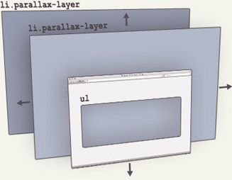
All the magic happens in the parallax class. Defining the height and perspective style properties will set the element's perspective to its center, creating a fixed 3D viewport. overflow-y: auto will allow the content inside the element to scroll normally, while the element's descendants will be drawn relative to a fixed perspective. This is the key to creating the parallax effect.
Next, the parallax__layer class. As the name suggests, it defines the content layer to which the parallax effect will be applied. An element with this class is pulled out of the general flow of content and positioned to fill its container.
Finally, we have the parallax__layer--base and parallax__layer--back modifier classes. They are needed to regulate the scrolling speed of parallax elements, shifting them along the Z axis (removing them or bringing them closer to the viewport). For brevity, I made only two scroll speeds - we will add a few more later.
Depth correction Since the parallax effect is created due to 3D transformations, the displacement of the element along the Z axis has side effect- the dimensions of the element change depending on whether it is closer or further to the viewport. To fix this, we need to apply a scale() transformation so that the element is drawn at its original size:Parallax__layer--back ( transform: translateZ(-1px) scale(2); )
The scaling coefficient can be calculated using the formula 1 + (translateZ * -1) / perspective) . For example, if the viewport's perspective is set to 1px and we offset the element by -2px on the Z axis, then the factor will be scale(3) .
Parallax__layer--deep ( transform: translateZ(-2px) scale(3); )
(i.e. translateZ(-10px) will scroll slower than translateZ(-1px)). Creating different sections of the parallax effect The previous examples demonstrated the basic technique of using simple content, but most parallax sites divide the page into different sections with different effects. Here's how we can implement this in our method.
First, we need a parallax__group element to group our layers together:
...
...
...
the CSS for it would look like this:
Parallax__group ( position: relative; height: 100vh; transform-style: preserve-3d; )
In this example, I want each group to fill the viewport, so I specify height: 100vh , although the number for each group can be different if needed. transform-style: preserve-3d prevents the browser from doing flat elements with parallax__layer , and position: relative allows child parallax__layer elements to be positioned relative to their group.
An important rule to remember is that when grouping elements, we cannot trim the content inside the group, as overflow: hidden on the parallax__group element will break the entire parallax effect. Uncut content will result in child elements will go beyond the limits. Therefore, you need to play around with the z-index value of the group to be sure that the content will be hidden and shown correctly as the user scrolls the site.
There are no hard or quick rules about working with layers and different methods imply different implementation. But to simplify debugging the positioning of layers, you can apply a simple transformation of group elements:
Parallax__group ( transform: translate3d(700px, 0, -800px) rotateY(30deg); )
Take a look at the following example and notice the debug checkbox!
Parallax (Greek) change, alternation) is a change in the apparent position of an object in relation to a distant background depending on the location of the observer. This term was primarily used for natural phenomena, in astronomy and geodesy. For example, this displacement of the sun relative to the pillar when reflected in water is parallax in nature.
In web design, the parallax effect or parallax scrolling is a special technique when background image in perspective it moves slower than foreground elements. This technology is being used more and more often, as it looks really impressive and cool.
This effect of three-dimensional space is achieved using several layers that are superimposed on each other and move with scrolling when scrolling. at different speeds. With the help of this technology it is possible to create not only artificial three dimensional effect, you can apply it to icons, images, and other page elements.
The main disadvantage of parallax is problems with site performance. Everything looks beautiful and stylish, but the use of javascript / jQuery, with the help of which the parallax effect is created, greatly weighs down the page and greatly reduces its loading speed. This is because it is based on complex calculations: javascript has to control the position of each pixel on the screen. In some cases, the situation is further complicated by problems with cross-browser and cross-platform compatibility. Many developers recommend using the parallax effect on a maximum of two page elements.
Alternative solutionWith the advent of CSS 3, the task has become a little easier. With its help, you can create a very similar effect, which will be much more economical in terms of resource consumption. The bottom line is that the site's content is placed on one page, and movement through subpages occurs using the CSS 3-transition method. This is the same parallax, but with some difference: the fact is that it is impossible to achieve movement at different speeds using only CSS 3. Besides, this standard not supported by everyone modern browsers. Therefore, there are difficulties here too.
ConclusionAlthough the parallax effect is popular, not everyone is in a hurry to use it when creating a website due to the above-mentioned problems. Apparently, it just takes time for technology to overcome the difficulties that have arisen. In the meantime, this option can be used on one-page sites: this way it will definitely be remembered and will be able to retain the user.
Parallax in javascript- jQuery parallax scrolling effect - a plugin that binds the parallax effect to the movement of the mouse wheel
- Scrolldeck - a plugin for creating a parallax effect
- jParallax - turns page elements into absolutely positioned layers that move according to the mouse
Hi all. Today I’ll tell you about a small script for creating a simple parallax effect.
The article will be short but informative, so in about 15 minutes you will be able to add parallax to your landing page. If you have long wanted to add this interesting effect to your website, then read on...
What is the parallax effect on the site?Let's first tell you what it is. So, the parallax effect in web design is a technique in which the background image moves slower than the elements that are above it. For those more experienced, I’ll make a reservation that we will not “bind” the parallax effect to the mouse cursor. Let's just create a parallax background. Let's get started.
How to make a parallax effect on a websiteSo, first of all we connect jquery library. As usual, between the head tags:
Now, you need to download and connect the Simple Parallax Scrolling script. I recommend using the compressed version immediately, since additional settings There is no need to do this inside the script:
Now, let's figure out what needs to be written on the html page for our parallax effect to work.
Smartlanding Creation of landing page
Data-parallax="scroll"
Data-image-src="path to image/bg.png"
Please note that the image is not placed in the header using img tag, but is set directly as an attribute in the container in which we want to implement parallax.
In principle, we can end here, but a few more words:
- If there are no other elements in the dive in which we want to implement the parallax effect, then you need to set its height, otherwise you won’t see anything.
- If not used adaptive design, you can set the width and height of the image directly in html using the naturalWidth and naturalHeight attributes.
- You can move images using the data-position attribute. This is analogous to background-position in css.
You can find other options on the official project page, which is listed above.