Basic photo processing techniques in Adobe Photoshop: noise removal. Removing noise using the Reduce Noise filter
We looked at how to install Photopop and change the interface language. Today we will look at the main commands, without which full-fledged work with this program is impossible.
How to get started with Adobe Photoshop?
Launch Photoshop
To get started with Adobe Photoshop, like any other program, you must first launch it ( the launch icon is almost always on the desktop ).
Launch Photoshop
Open image
To edit photos in Photoshop, you need to open them in it. To do this, go to the menu File → Open (or press the key combination Ctrl+O) and in the window that opens select the desired picture(in my case, this is a photo.jpg picture from the archive at the end of the article).

Open the picture
Changing the scale
Sometimes the photos are too big (they don't fit completely on the screen), and sometimes they're too small (you can't see anything).
In such cases, the tool and its “additional buttons” on the toolbar (under the main menu) help a lot. I think it's obvious which button enlarges the image and which reduces it.
Zoom in on the photo several times and see how its quality has changed. You can see the “bricks” from which they are built raster images– pixels.

You can also enlarge (reduce) photos using View menu or keyboard shortcuts Ctrl+ and Ctrl- respectively. These are just a few of the many ways to change the scale in Photoshop.
Change the scale
When working with Adobe Photoshop, you also need to be able to quickly set an image actual size . There are also many ways to do this. Here are a few of them:
Resize the image to actual size
How to set an image size that will be printed, I think you already guessed it yourself. But, just in case, a couple of ways:
- “Print size” button on the toolbar;
- Using the View menu :)
Set the image size to what it will be when printed
Setting up the Photoshop interface
When working with computer programs Each user customizes their interface for themselves: removes (adds) toolbars, changes their location, etc. How to do this?
Designed for this Window and View menu
. Let's try to remove all the tools.
It's simple: in the Window menu, uncheck all the boxes.
Remove all panels and tools from the window
The window has become “naked” and now it is certainly not clear what can be done with the image.
Display:
- tools (“strip” with various buttons - usually located at the left border of the window),
- parameters (panel for setting up tools and changing their properties - located under the main menu),
- layers (all work in Photoshop is based on working with layers - in a couple of lessons we will look at what it is and what it is used with),
- navigator (this is to see a thumbnail of your image, how it looks after changes),
- and styles (and this is already ready-made templates to change the appearance of text or other objects in your creation).
All these settings can be found in the Window menu. They can also be very helpful when working with the Ruler. You can find and display them in the View menu .Display the tools needed for work and place them in places convenient for you
What are color models?
Let's now consider color models, that is, methods and principles for constructing color using quantitative characteristics.
I think everyone knows that from three basic colors you can make any other shade, for example yellow + red = orange, red + blue = purple, etc.
The same principle applies to displaying colors in Photoshop. That is, figuratively speaking, several primary colors are taken and “mixed” in different proportions - this is how other colors and their shades are obtained.

Basic color models in Photoshop RGB and CMYK.
What does RGB mean?
RGB (Red-red, Green-green, Blue-blue) - This color model, which is used as the main one in all computer systems. All image editing functions are available for RGB mode in Photoshop. And if you are preparing an image for display on a computer (for a website, presentation, game, etc.), then this is the mode that you need to use.
What is CMYK?
CMYK (Cyan-cyan, Magenta-magenta, Yelloy-yellow, Key-“key”) – this model describes real printing inks. Cyan, magenta and yellow inks make up the printing triad, but when mixing them it is impossible to obtain the perfect black color, so the main ink, black, was included in the number of basic printing inks (I think those who have printers know that three are needed for printing colored and black paints :)). This model is used only in printing, so the transition to it must be made immediately before printing, and it is advisable to edit the image in RGB mode.
To change the mode in Adobe Photoshop, go to the menu Image → Mode → Select the desired mode .

Change the display modes and see if the appearance of the photo changes.
How to make a photo black and white?
In the same way as in the previous step, Can you take the photo in black and white? – Grayscale mode (but this is if you are sure that you don’t need colored paints, or the printer has run out of color cartridges - there are other ways to experiment with color, since in this mode color data is deleted and you cannot restore it later, even if return RGB mode).
Change the display modes to Grayscale.
What is image resolution?
Another characteristic of the image is resolution – the number of dots (pixels) per inch.
Accordingly, than higher resolution, those larger size file. But does picture quality improve with increasing resolution?
This is not entirely true.
Depending on the purpose of preparing images, they can be divided into several groups:
- for display (presentation, web page, animation, video)– it is considered correct to prepare such images with a resolution of 72 ppi or 96 ppi;
- when printing on a printer its resolution is taken into account - the number of dots per inch that it can display (laser and inkjet printer have a resolution from 600 to 1200 dpi). The ratio between the technical resolution of the printer and the image resolution differs by a factor of 4. That is, if technical approval printer is 800 dpi, then the printed image will have a resolution of 200 ppi.
Accordingly, for printing on a printer, you need to prepare images with a resolution of 150-300 ppi. - for printing in printing houses The image must have a resolution of 300 ppi.
That is, when creating an image (File → New) you must indicate the name, image dimensions, resolution, color mode and select a background color.

Create new document for printing, size standard photo (portrait orientation) and with a transparent background
How to open two windows at the same time in Photoshop?
You now have two windows open. To see them at the same time, use the menu Window → Arrange → Mosaic. Tool “Move” “drag” the picture onto a new (empty) document and place it in the desired place (to do this, you need to “grab” the picture with the mouse and drag it to right place, and only then release the mouse).
Transfer to your new file picture and place it in the right place.
Save the image in Adobe Photoshop
To save the image, you need to go to the save window ( menu File → Save As... or Ctrl+S ) indicate the desired name, file type (.jpg, .png, .gif, etc.) and save location. If you are going to edit this image someday, then you need to save it in Photoshop format.psd.
Save your “new” picture in two formats.png and.psd under the name “Lesson 1” (two files)
Adobe Photoshop cs5 has a panel with which you can quickly adjust the appearance of the window: scale, add/remove rulers, guides, arrange windows, etc. – I think it’s very convenient.

This concludes the lesson. 🙂
In the next lesson we will look at how to select areas of images and work with selected fragments.
For efficient work in the Photoshop program it is very useful to know all the subtleties of such a useful, one might say, the necessary tool"Selection"
Trimming the corners of the picture.
Here we have two options: trimming the corners of the entire picture and trimming the corners of part of the picture.
Option 1
Open the drawing. Make sure that the picture mode is RGB (Image tab --> Mode --> RGB or in English Image --> Mode --> RGB). Open the Layers panel (F7 key) and unlock the background layer by double-clicking on the lock located on the right with the left mouse button. Next, press Ctrl+A, go to the Selection tab --> Transform selected area. IN top panel change the angle to 45°, as indicated by the arrow in the figure.
Now we need to achieve the desired scale of the corners.
This is easy to do using auxiliary guides. They need to be arranged according to the size of the future corners. After this, we drag the zoom frame by the squares in the center of the side of the frame so that the edges of the zoom frame stick to the intersection of the guides.
After that, press Ctrl+Shift+I (invert the selected area) and press the Delete key.
The corners were removed, a transparent background formed under them, indicated in Photoshop by gray and white checkers.
See other materials on the secrets of Photoshop:
Photoshop Secrets: Improve Your Skills
Photoshop Secrets: Improve Your Skills, continued
Photoshop secrets: the intricacies of working with text
Option 2
This technique is more complex and is suitable for cutting only rectangular areas. It will also not work to act according to a predetermined algorithm. You'll have to invent it on the fly. An example course of action is:
First you need to select the desired area using a rectangular selection (V key).
Then press Ctrl+J, this will copy the selected area to new layer.
Then we repeat the steps from the first option on a new layer.
But the corners will remain on the original layer and the results of the work simply will not be visible.
So after all these actions, you should use the Free Transform tool (activated by pressing Ctrl+T) to enlarge the new layer so that it covers the area that we selected at the very beginning.
If the increase is unacceptable, then use the Stamp tool (S key) to mask the corners on the original layer.
Photo frames
How to create frames using selection is described in the article: Creating a Frame in Adobe Photoshop. Round, oval frame
Erasing small objects with an eraser
If the diameter of the eraser is too large, and along with the defect it also affects the desired area, then there is no need to reduce the diameter of the eraser to the minimum.
It is enough to select the piece with the defect using the Lasso tool, and then use the eraser. It will only wash in the selection area. Then don’t forget to remove the selection by pressing Ctrl+D.

Chapter 1
To make portraits look more catchy and attractive, retouchers often resort to additional lighting adjustments after shooting. If you need to further darken or, on the contrary, lighten some area, use the so-called “Dodge & Burn” technique. This is nothing more than “highlighting and darkening”. And where the curves fail, they resort to this technique.
Let's look at the tools that will help us with this. First, we will emphasize volume in a destructive way; it has its advantages, which you will now see. And I highly recommend getting at least a simple graphics tablet for such retouching. Make your life much easier.
Since the technique is destructive, let's first duplicate our portrait layer using the Ctrl+J key combination.
Now we select the first tool that we will use - DodgeTool. It is located on the toolbar in this list. We already became superficially familiar with it when we retouched the eyes, now it’s time to look at it in more detail. Its settings have absolutely standard settings brushes, as in other similar tools. For our work we will use a brush with soft edges. Next comes the area of application, we can choose shadows, midtones and highlights.

In each area, corrections occur differently. If we brighten the shadows, the color will fade and the contrast will decrease, but this way we can pull out details from some of the shadow areas of the photo. If you highlight the midtones, the color remains virtually unchanged and the image is softly highlighted. If you influence the light, the saturation and brightness in light colors will greatly increase. This is best used for the eyes. We set a small Exposure value to have more control over the changes, set the brush size to match the edited area and make a few strokes. If necessary, reduce the Opacity of the layer a little.


Now let's edit the midtones a little. We copy everything visible information to a new layer using the key combination Ctrl+Alt+Shift+E. Switch to the BurnTool. We can do this either on the toolbar, or we can not switch from DodgeTool and simply temporarily enable BurnTool by pressing the Alt key. It will work with the same settings and in the same brightness range. We set the area of mid-tones and walk a little along the contour of the face, nose, eyebrows.

Let's lower the Opacity a little.

I would add a little more highlights to the hair. Copy everything to a new layer using the combination Ctrl+Alt+Shift+E. And now let's switch back to DodgeTool and work in midtones, highlighting the highlights on the hair. And again let's lower the space a little. With constant adjustments, the eye can become blurry and it is very easy to go too far.

Therefore, if you have gone too far somewhere, then simply lower the Opacity parameter of the adjustment.
At the very end, it is better to merge all the layers on which we adjusted into one. This is the main drawback of the method - the file becomes large size and you have to reduce the number of layers with adjustments to reduce the size. Well, that's a plus this method not automated in any way. And the advantages of this method are that you don't have to worry about the tonal range of adjustments, if you only need to adjust the highlights, then just select Highlights and go ahead.
Let's now tint our portrait according to any convenient scheme that we discussed in previous chapters. I chose cold shadows, warm lights.

Chapter 2
The previous method was good for creativity, but what if we don't have time for it? We need to somehow automate the process. Then we will have to work with the information that is already in the image. Pushing away from it we will build masks.
We will edit this image based on the fact that it lacks volume.

How to add this volume? It’s very simple - you need to enhance the highlights and darken the midtones. The same thing we did manually, but now masks will help us.
Let's first go to the Chanels tab and see on which channel the skin looks the most detailed and contrasty. In most cases, when the skin in the image is presented in the shades in which we are accustomed to seeing it, the blue channel will have the highest contrast.

This is exactly what we need to create a glare mask. Remember this and go back to Layers, where we create a ChannelMixer adjustment layer. For now, all we need to know about the settings of this layer is the list of presets. We need Black&WhitewithBlueFilter.

This will just make the blue channel visible. Based on this image we will build a mask. Let's adjust. Create a Levels adjustment layer and adjust the black point until only the highlights remain. We also press the white point a little so that the mask has more contrast.

Now let's create a new one empty layer using the key combination Ctrl+Alt+Shift+N. And with a brush with soft edges, we paint over the unwanted areas with black, so that only the skin in the plot-important parts of the photo is highlighted. And now what we got needs to be converted into a selection. Go to the Channels tab and hold down Ctrl key Click on the RGB channel.

Now go back to Layers and create an adjustment layer with curves. Now we combine all the auxiliary layers into a group using the Ctrl+G keys and hide it. A mask is automatically created for the curves layer. Select it with the Alt key. And edit the Feather parameter to blur the boundaries.

Now let's raise the curve in the midtones, but not with one point, but with two. We will raise the black point and press the white point so that our curve rises parallel to the neutral line, which is at 45 degrees. This way the color saturation will not change and the adjustment will look more natural.

Lower the Opacity a little.
Now it's the turn of the midtones. Let's now leave only ChannelMixer from the adjustment layers. The desired preset has already been selected there, we only need to select the midtones.

We will do this using the already known GradientMap. Create an adjustment layer. And select the third preset.

Under the gradient, click anywhere, a slider with black color is created. Swap the white and black sliders so that the white one is in the center.

He will highlight the average ones. We adjust so that the areas we need are highlighted with white, we can use the black sliders to tighten them from the edges.

Now we need to turn this into a selection in the already known way. Create a new layer with curves and again blur the mask a little. Now we simply darken the midtones using the same principle - we press up the black point and lower the white point.

The steeper the curve, the more saturated the color will be; the flatter it is, the more the color will tend to gray. Let's reduce the Opacity parameter.

We can now combine the layers with the correction into a group and adjust the Opacity slider if you think the result is too striking.

Chapter 3
Let's now learn how to use the DodgeToot and BurnTool non-destructively. To do this we need to create a layer filled with a medium gray color.
Let's create a new layer using the key combination Ctrl+Shift+N, only in the options we will select the blending mode not Normal, but SoftLight. And check the box to fill it with gray.

SoftLight is a contrast blending mode, in which if the brightness of the pixels is lower than 50% gray, then this layer will darken, if higher, then it will lighten. If the brightness of the pixels of this layer is strictly at the level of 50% gray, then there will be no changes. Therefore, if we want to somehow increase the volume, emphasize the shadows and highlights, then we need to take the DodgeTool tool, already known there, and set its range of mid-tones, since you will be painting in mid-gray, and these are the mid-tones. And set the exposure to no more than 50%, and choose a brush with soft edges. Now we just draw on this layer where the highlights should be.

Yes, this method is not automatic, it does not work with the information that is in the photograph and you need to draw all the volumes manually, but it is used more likely to adjust the lighting. To add additional highlights that were not previously found on these surfaces. This technique and its variations are used by almost all the most popular retouchers.
Now it's time to draw the shadows. Let's create a new SoftLight layer with a fill of 50% gray. Take the BurnTool, set the brush to soft edges, the range is also mid-tones and the exposure is no more than 50%. And we begin to draw the shadows. It is always better to separate the drawing of shadows and highlights, since you can always edit them separately later. When we're done, lower the Opacity a little.

This method is a little inconvenient in that if you have overdone it somewhere, you cannot simply remove the adjustment with an eraser. Since the layer itself will be erased and you will no longer be able to darken or lighten it. To cancel the adjustment, you need to take a brush, select 50% gray as the color and paint over this area.
There is another method. It allows you to draw volume on an empty layer, but instead of the DodgeTool and BurnTool tools, we will need to use a brush with black and white colors. But in my opinion it is even more convenient.
Let's create a new layer, select the SoftLight blending mode, but we won't fill it. Now take the brush tool and select the preset with soft edges. Use the D key to reset the colors to black and white. And using the X key we will switch them. Set the opacity of the brush, not the layer, to no more than 20%, and often even less is required. And let's draw volume.

I wouldn’t recommend drawing both shadows and highlights on one layer, although if you’ve already gotten good at it, the X key will help you a lot. fast switching flowers. The advantage of this method is that we can cancel the adjustment with a simple eraser, we don’t need to do anything additional, we just erased the unwanted place and continued drawing.
The advantages of these methods are obvious. Firstly, this adjustment is not destructive and can be easily undone and edited. Secondly, it does not increase the file size at all and does not load RAM, therefore it will work faster and without lags. Plus, you don’t have to rely on the light pattern that was originally present in the portrait, but draw new highlights and shadows yourself.
Chapter 4
We have already learned enough technical things and corrections to now direct it all into creativity. Let's try to give our photo more expressiveness and atmosphere by redrawing the light on it, adding local toning and fog.
First, create an adjustment layer with curves and the first point we lower the lights enough so that the shadows plunge into black. Then use the second point to align the dark tones so that there is no clipping. And with the third point we adjust the darkening of the midtones so that the curve is smooth. This way we evenly darken the entire important information no gaps in the shadows.

Now all we need to do is take the brush tool, set soft borders and paint on the mask of this layer with black to bring back the light.

It's better to do it on graphics tablet, but if there is none, then it is better to set the Opacity parameter lower in order to have more control over our actions. It is better to paint where there was already light in order to further create the feeling of radiance in these areas, thereby increasing the contrast. Of course, we draw plot-important objects; here you can make the brush size smaller. And a little about the surroundings too. Try not to touch the very corners of the photo, this will make the composition look more pleasant. It turns out to be a kind of vignette.

Now we need to paint the surrounding background a cool color. Thus, we will separate the foreground from the background and create color contrast. You, most likely, already guess how this can be done through levels or curves, so we will go the other way. Create a new layer and set its blending mode to Overlay. Roughly speaking, this is the same as SoftLight, only stronger in impact. Select the brush tool, set soft edges and Opacity to 100%. We set the color to saturated blue, with a slight shift to cyan. And draw on our layer.

Don't be alarmed that everything is so acidic. This is for more control. Now, when we finish outlining, we will clearly see where we need to correct the boundaries. When finished, select the eraser, set soft edges and erase unwanted areas. You can’t erase it very meticulously, since the borders won’t be so clearly visible anyway.
Now lower the Opacity parameter of the layer itself to about 20%.

And, if necessary, we can adjust the color and tone using Hue/Saturation. We will edit destructively, press Ctrl+U and edit.
Now let's add some smoke. In the brush presets, select this one. And increase the diameter. Lower the Opacity parameter and carefully draw in the foreground layer by layer. We draw so that the haze thickens towards the edges. Use black to slightly correct the fog using the mask.

Now let's add some glow to the sky. Create a new layer and set the blending mode to Screen. It works in such a way that any tone different from black highlights the underlying layer. Black is a neutral color for this mode. With the brush tool selected, hold down the Alt key and use an eyedropper to take a color sample from the clouds. Set the Opacity lower and draw glows.

As a finishing touch, create a layer with curves and slightly darken the midtones, and also slightly raise the black point, creating a LowContrast effect. Which, by the way, is very popular among wedding photographers.
Chapter 5
Let's now work on creating a little collage. If the sky hadn’t been knocked out in the picture, we could have gotten by with just one photograph, but this is even more interesting.

Let's copy the original layer by pressing Ctrl+J.
Now let's mirror it, to do this press the key combination Ctrl+T and right key mouse click on the layer. Select Flip Horizontal from the drop-down menu. Then click on the checkmark.

And now we will mirror these two layers along an axis that will pass through the center of the image. In Photoshop, unfortunately, there is no tool that is designed specifically for this, but we can do it using masks. We lower the opacity of the top layer and see that the shapes of the houses intersect along the central axis.

Select the RectangularMarqueeTool for a rectangular selection and outline half of the photo. Then create a mask and increase the opacity of the layer.

It already looks cool, but let's now click on the mask and invert it with the Ctrl+I key combination.

After clicking this several times, we will choose the option that we like best.
Now let's replace the white embossed sky with a more attractive one. To do this we need to select white spot. Let's create a mask. Let's try slightly different methods than we did before. Create a Black & White adjustment layer. And in it we move the sliders of all colors all the way to the left.

Now create a Levels adjustment layer. In it we strongly press the black point and slightly the white one.

Now all that remains is to get rid of the small white areas inside the black one. To do this, create a new empty layer and quickly draw a selection using a polygonal lasso without going beyond the contours of the black area. Now we reset the colors with the D keys and use the X key to set black as the foreground color.

Then press Alt+Backspace and the mask is ready. Then go to the Channels tab. Ctrl-click on the RGB channel, return to Layers and turn off the auxiliary layers.

Click on the top visible one, press Ctrl+Alt+Shift+E and copy the entire visible area to a new layer. Please note that the selection is not yet deselected. Now click on the mask creation icon and use the Ctrl+I key combination to invert it. Now we can remove the auxiliary layers.

It's time to replace the sky. Open the second image and copy the contents to the clipboard Ctrl+C. Switch to our main document and press Ctrl+V. Place this layer under the top one.

Now let's make the sky cold. Create a Levels adjustment layer and move it above the sky layer. Lower the gamma of the red channel and slightly increase the gamma of the blue channel.

Now let's darken the sky and the tops of the houses using curves. Lower the midtones and paint over the mask with black soft brush down. And lower the Opacity parameter.

Let's finish by adding a little vignette using a LassoTool selection with a high Feather setting. Darken with a Levels adjustment layer.
Working with layers. Photoshop for the photographer: Lesson No. 2 Color correction and toning in Photoshop. PHOTOSHOP FOR THE PHOTOGRAPHER: LESSON No. 4
When reading articles about Photoshop, I'm often surprised by how many authors make the solution inherently complicated. simple tasks on processing. Many “monumental” writers suffer from this, such as Dan Margulies. But this can be forgiven for him - his task is to write about all the subtleties and nuances of the processing process, to consider it from all angles and sides. Although it is precisely this feature of the presentation of material in his books that repels many readers.
In fact, the roots of such methods of “sharpening in 40 steps” grow from a very simple thing - the people who write these tutorials have never worked with a large volume of photographs. That is, as a rule, they have a couple of photographs and are ready to spend an evening or two in the process of processing them. But when you have constant orders, and from each photo shoot you need to seriously edit several dozen frames, you begin to think about simpler and convenient ways processing.
We'll talk about them today. I'll tell you about five simple, but very effective tools Photoshop, which I constantly use in my work.
Before processing photos in Photoshop, I always work with the frames in a RAW converter first. This is where I do the main color correction and primary photo processing. Essentially, I create a “skeleton” of processing, and in Photoshop I work with the details of the photo.
So, we have worked with the photo in the RAW converter and open it in Photoshop. Photoshop meets us a huge amount processing tools for all occasions. But we will talk about the simplest and most effective of them.

The main function of the Dodge Tool/Burn Tool is to lighten/darken individual areas of the image. Essentially, you can “draw” darkness or vice versa – lighten the photo. It's very simple, try it: I'm sure you'll appreciate this tool. Dodge/Burn Tool has only two, but very important settings.
Range — Select the application area
You can use this tool on the dark (Shadows), light (Highlights) or neutral (Midtones) areas of the photo. For example, you need to lighten the dark areas of the chin (when processing a portrait), and leave the light areas untouched. In this case, we set the Shadows mode in the Dodge Tool, and it will only lighten the dark areas of the places where we apply it.
Exposure - force of impact
It is very important to set the impact force correctly. Many people, when experimenting with Photoshop, try Dodge/Burn 100%. And by darkening the image, you get black “holes,” and by brightening it, you get complete overexposure. Of course, having received such a result, they no longer return to this tool. But Dodge/Burn is a subtle tool. If you are working on shadows or highlights, try an application force of 7-10%, if with neutral areas - 10-20%. For each case, the force of influence is selected separately, but after working a little with this tool, you will begin to feel what kind of power is needed in each specific case.
Usage
Dodge/Burn has many uses:
- Brighten your iris
Just apply the Dodge Tool to the iris - this is the easiest way to brighten it. Thus, you focus the viewer’s attention on the model’s eyes.
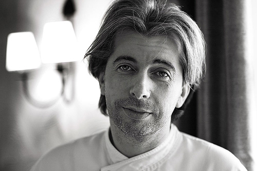
In all these portraits, I highlighted the iris of the eyes precisely in order to draw the viewer’s attention to the eyes and add psychology to the frame.

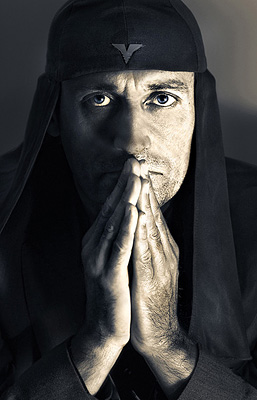
- Darken the lines of the face shape in a man's portrait
Cheekbones, jawline, nose line, eyebrows - any facial lines, if darkened a little, will acquire greater volume and contrast. The man in the photo will look tougher and stronger-willed.
I use this technique when processing almost all male B/W portraits. This technique is not always suitable for color, as it “destroys” the colors, but on a B/W picture it works just fine.
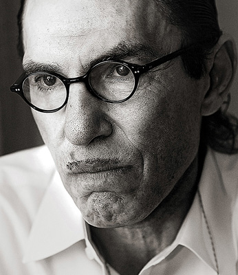
In a female portrait, this technique must be used very carefully, since a woman will only be adorned by emphasizing those facial lines that give her femininity. Otherwise, you will get a portrait of a masculine creature.
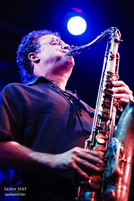
- Brighten backlit areas
Backlight in itself is a wonderful thing. But if you use the Dodge Tool to enhance its effect, the picture will become even better. This looks especially great in concert photographs, when the musicians are illuminated by good backlight.
- Whiten your models' teeth
Using the Dodge Tool is the easiest and most effective way to whiten teeth in a photograph. A little later I will definitely write a separate lesson about proper teeth whitening using the Dogde Tool.
2. Clone Stamp

There are several tools for retouching images in Photoshop, and each of them is good in its own way. But “Stamp” is the most versatile tool to use.
Its function is to take a certain area of the image and copy it. Thus, we can, for example, retouch wrinkles - simply “replacing” them with areas of smooth skin. To do this, press Alt and select the area from which the image will be taken, and then, simply by clicking on the desired areas of the image, we will copy it to them.
In stamp settings, it is important to pay attention to two parameters:
Mode
These are the modes in which the stamp will operate. For example, in Darken mode, the stamp will only “replace” lighter areas than the selected area. Essentially, you can darken the light areas of the image, which is why the name of the mode is Darken. And, accordingly, in Lighten mode the stamp will only work for more dark areas images by brightening them.
Clone Stamp has many modes of operation - experiment with them, I'm sure you will get interesting results.
In my opinion, it makes no sense to describe the operation of each mode - in Photoshop, for all tools, essentially the same principles of operation of the modes apply, only changing slightly to suit the specifics of a particular tool.
Opacity means opacity. Simply put, the lower the percentage you set in this setting, the more transparent the “work” of the stamp will be. For example, at 100% the stamp will completely replace the selected area, and at 50% it will be translucent. For face retouching, as a rule, 10-30% is used, otherwise the stamp mark will be too clearly visible.
Using Clone Stamp
- Retouch
Retouching in all its manifestations is the main purpose of the stamp. First of all, the stamp is used for skin retouching - removing wrinkles, dark circles under the eyes, swelling and other beautiful creations of Mother Nature.

You can also retouch, for example, unwanted object in the frame. Unless, of course, it takes up half of the photo.
It is very convenient to use a stamp to eliminate small overexposures. For example, your model has a small spot of overexposure on the tip of her nose. We take the stamp, set the Darken mode and in a couple of clicks we darken this spot.
3. History Brush
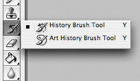
History Brush is a time machine for photo processing. You can take any stage of processing and use a brush to paint from it according to your image.
History Brush is fraught with enormous possibilities. I have already written in detail about the operation of this tool in a separate article. In it you will find detailed lesson on using history brush and learn how to sharpen only the areas of the image you need.
Of course, increasing sharpness is not the only area of its application. In future articles, I will tell you how to work with color in a photograph using the History Brush.
4.Black&White
The Black&White tool is located in the Image—>Adjustments tab. Or you can simply create an Adjustment layer on the photo.
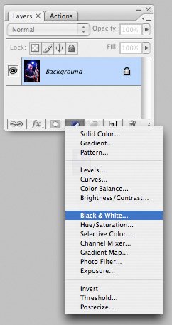
The main function of the Black&White tool is the “correct” conversion of a color image into black and white. Correct because you can change the black and white display of each of the colors. This way you can get a beautiful and “tasty” b/w picture.
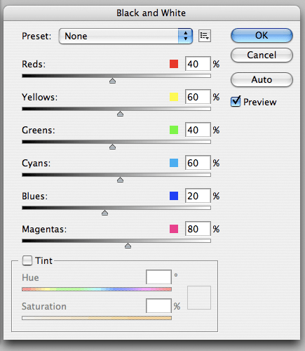
But the functionality of B&W is not limited to this.
With this tool you can get very interesting and color picture. Let's apply B&W to our image, and then turn on the layer mode Overlay.
Now, by manipulating the B&W controls and layer transparency, we can get a very interesting picture. For greater clarity, I set the Opacity of the layer with B&W to quite high - 62% and turned the Greens, Cyans, Blues and Magentas levers to maximum.
As we can see, the picture immediately became richer and more contrasting (click on the picture to enlarge).

Now let's pay attention to the tick Tint. By turning it on, we can tint the image in the color we need.

Usage
There are a lot of options for using B&W both when working with color and when processing B&W.
In one of the following articles, using the example of processing several photographs, I will talk about all the main nuances of working with Black&White.
5.Shadow/Highlights

Shadow/Highlights is also located in the Image—>Adjustments tab (by the way, there are a lot of interesting tools there, I advise you to experiment with them all)
This tool is designed to darken highlights and pull highlights out of shadows. In addition to the most obvious use - eliminating overexposure and underexposure, S/H also works great for creating a feeling of greater depth in the picture. We can add dark undertones to light areas, and light tones to dark areas. Thus, the picture will become more voluminous and deep.
For example, in this photo using S/H I added volume to the puppy’s fur and the picture immediately became more interesting.

In fact, Shadow/Highlights are absolutely indispensable tool for any serious processing. Almost any photo can be made better if you use S/H wisely.
I would like to talk about all the S/H settings and its functionality, but this is really a topic for a separate article. In the future, I will definitely return to the Shadow/Highlights theme, but for now just try to experiment - try it different options settings and look at the result. In my experience, this method is the most effective for learning new things.
As we can see, all these tools are very easy to use, but at the same time incredibly effective. Try experimenting with them and you will feel how many possibilities they provide when processing.
I think it’s worth making a series of articles about simple but very effective tools in Photoshop. And in the next article I will talk about tools for serious work with color in photography.