Fashion trends in web design. The Rising Importance of Landing Pages
In the era of developing IT technologies, you simply cannot stand aside and watch what is happening. You need to be this happening. In order not to be an outsider, you need to draw knowledge from all possible and impossible sources and keep abreast of all events. 2016 is coming to an end, which means that 2017 is already around the corner and will bring something new to the field of web development. And what exactly, you will read in this article!
Don't be an outsider, keep up with the times.
Bots
Simple web pages are no longer so popular, they are becoming more and more interactive, moreover, after a while our online life will be so simplified by various interactive prompts that we won’t have to strain our brains at all. Bots are now widely used and this is just the beginning. Everyone knows the Slack application for corporate communication, and there you can also find a bot that greets you, asks for your name and immediately inserts it into your profile. Bots are popping up in many other tools and applications, ushering in the era of online assistants.
Motion UI
Animation, video, GIFs have long become our everyday life, everything is so lively and attractive, what else does the user need? They are widely used for fast CSS creation transitions and animations to ensure ease of use. Latest version Motion UI is equipped with an animation group service system, flexible CSS templates, which have expanded capabilities for a full transition and are able to work with all types of animation JavaScript libraries. We are more than confident that mobility will completely replace use static images.

Adaptability
Mobile first is the slogan of our time, every day every person, at least once (not to mention those addicts who actually live in their hands with a phone) search for information on the Internet, send messages or make calls, so their use should be as convenient as possible. If you are a website owner and still haven’t heard about responsiveness, it’s time to grab your feet and implement it , in order to ensure your potential client comfort of using your site. As you may have already noticed, this is a real must-have in the world of web design and development; in addition, it will help you save on mobile application development.

One page site
Are you confused by sites with a bunch of pages, where there is so much of everything and everything is so incomprehensible? Don't worry, the era of one-page websites is just around the corner. This type of site is very popular among large companies, they are more convenient to use, and it is easier to find the information needed by a user who has visited the site for a specific purpose.

Javascript is on the rise now
Javascript is the future, despite rumors that it has shortcomings and weak sides. No one disputes that they are indeed present, but what is ideal in this world? Even Mac OS uses JS in its hardware. Moreover, its front-end libraries such as Angular, Node, React are quickly gaining popularity, as well as other smaller libraries.
It's no surprise that Javascript has become an integral part of the standard web development stack, along with HTML and CSS. And this fact speaks for itself.

Parallax effect
This effect is most often used, but not many people know for sure exactly what it is called. To clarify: This The best way add volumetric layers to the site , it can also be used to add stunning 3D effect.

Trends that will change the world
In this article, we have collected all the promising web development trends that will immediately change the world. But we don’t yet know what trends 2017 has in store for us. Stay informed modern technologies and maybe one day you will be so inspired by what is happening that you will come up with something revolutionary yourself?
Let's figure out what it means to be popular, fashionable and modern in web design in 2017. To do this, let's look at the main trends in web design. Most of them wander from year to year and have already become an integral part of modern website building. This is especially related to the development mobile technologies, communication channels and device improvements. For example, a trend such as website mobility has become mandatory. The commercialization of the Internet also dictates its strict conditions to designers and web developers. At the same time, some trends weaken and become less popular, but still remain quite active. Fashionable hobbies characteristic of a short period also appear. For example, last year these were icons with a long shadow of the objects depicted. This year geometric patterns have become popular, we will also look at them. So, let's take it in order.
1. Mobile, responsive design
Today, perhaps, the most important and mandatory trend. The site should look equally good on all resolutions of monitors, laptops, screens mobile smartphones and tablets. Search engines, by the way, very closely monitor how well the site is adapted to various devices, and based on this they determine their place in search results. 
2. Active typography
For several years now one of the most popular trends. Large fonts and typography on the site have two components. Firstly, aesthetic - beautiful lines, curves and lettering are themselves an decoration and decorative element. And secondly, this is functionality - using large font you can unambiguously and emphatically convey the main idea to the visitor. 
3. Widescreen video
The full-screen video on the background of the site undoubtedly immediately captures our attention. This good welcome to interest the visitor. Modern development technology makes it easy to embed video on a website, which means designers will increasingly use this technique. However, there is one caveat: watching the video is interesting only the first time, the second and third time it gets boring. Therefore, this technique is only effective for new visitors.
5. Cinemagraphs
A good alternative to widescreen video and great photos on the background. Cinemagraphs are photographs in which small, repetitive movements occur. They are usually presented in gif format and give the viewer the illusion of watching a video. More about cinemagraphs with big amount examples can be found in the selection 
6. Flat design
Another powerful trend recent years. Sites made in flat color, accuracy and clarity are inherent. But, in Lately, a new type of flat design has appeared - Semi flat. This is when the entire design is done in flat color and only one element has shadow, gradient or texture. As a rule, this element is a button, which is given volume or prominence to attract the attention of visitors.
7. Microinteraction on the site
Now great attention web design focuses on the micro-interaction of the functionality and design of the site with the visitor. The essence of which is that the visitor can clearly see the result of his action on the site, be it an adjustment custom settings, following a link, confirming an operation, interacting with active icons, buttons, switches, counters and other elements.
8. Animation of objects
The capabilities of modern html5 and css3 allow you to use a large arsenal visual effects Online. This makes interaction with the page more interesting and exciting for the visitor. So in the new year we will also see the most unexpected interactive micro-movements of objects, usually reacting to mouse movement. Perhaps we'll see examples of more complex animation.
9. Vibrant color schemes
Popular fashionable colors of 2017 favor brightness and saturation. Interesting original shades of scarlet, mustard, yellow, emerald, deep blue, as well as red, lilac and chocolate will help your site stand out and acquire its own unique style. 
10. Site scrolling
Since the site's scrolling is ideal for mobile devices, its presence will be significant in 2017. The only thing is that scrolling does not leave room for user interaction, and therefore, there is a certain fatigue from endlessly loading content. Perhaps the trend will turn towards a combination of simple control elements with scrolling.
11. Parallax effect
Parallax is a change in the apparent position of an object relative to a distant background. In web design, this effect is used when scrolling a site, when objects and background scroll with at different speeds, resulting in the illusion of three-dimensionality. The trend is quite stable, so we will see sites with parallax more than once.
12. Modular design
Modular design, or a card interface consisting of self-contained blocks of meaning, has been popular for some time. This trend is very good for mobile devices, since the blocks line up well for any screen resolution. But on large sites they look quite the same and are difficult to hierarchy and structuring.
13. One-pagers
One-page sites, landing pages, landing pages have become an integral part of the modern Internet. You can read more about what a landing page is in the article and. In 2017, landing pages will place an increased emphasis on a button calling to action - order, call, sign up, etc. Everything else that distracts the attention of a potential visitor will be cut off.
14. Graphic advertising
I would also like to note one thing that I remember about the past year, and most likely the trend will continue in 2017. Due to the commercialization of the Runet and the growth of online commerce, the demand for graphic promotional materials for advertising and promotion has increased significantly - banners, teasers, cards, flyers. 
15. Automation of typical processes
All standard solutions and procedures on the website are gradually being replaced by automated processes, which eliminates the need to communicate with support service or online consultants. Due to this, the popularity is growing various applications and extensions. Now you can buy a product or service, place an order, make an appointment, reserve seats, transfer money, fill out a form or take a test - all this can be done online in a few mouse clicks.
16. Infographics
Graphic representation in the form of infographics is still popular and in demand. Text accompaniment beautiful picture or an icon together with stylish design elements make the infographic aesthetically attractive. Comparative infographics are especially visually clear and interesting - such as what happened and what happened, yes and no, pros and cons, dos and don’ts, etc. You can also use infographics to tell a step-by-step story or vividly present boring statistics. 
17. Hamburger menu
Hamburger menu is a visual icon of three horizontal stripes, usually at the top in the corner of the site, when clicked it opens or slides out from the side full menu. Many experts predict that this trend will fade, due to the fact that most inexperienced users simply do not understand the purpose of this icon. Therefore, web designers tend to favor simplified navigation. But, nevertheless, we will see the hamburger menu more than once on newly created sites.
18. Icons
Icons, as a way of presenting information and a visualization tool, have been and remain one of the most popular and favorite trends among designers. It is enough to place the corresponding thematic icons near the blocks with text - and now the entire text acquires logical and visual orderliness and structure. So, in the coming year we continue to actively use icons.
19. Letterstacking
Letter stacking is text in a square. Essentially, this is an example of a complex creative solution - you need to imagine long text in the volume of a tiny space. At the same time, it should look beautiful and original. This year it is also fashionable. 
20. Blank button
To save space and space, a blank button appeared on mobile devices some time ago - a large inscription with a square outline around the word. Such a button gives an overview of the background behind the button and at the same time retains its functionality as a full-fledged button. Plus, as a design element, such a button looks stylish and neat.
21. Avoid stock photos
Some experts have noticed that designers are starting to abandon stock photos. Because the modern devices allow you to quickly and efficiently take a photo yourself, then you can avoid stock impersonality and uniformity and make your own unique photo and create your own unique design.
22. Unusual angles in the photo
Finding interesting angles in photos has become available to any owner of a smartphone with a camera. In this regard, creativity when creating photos is off the charts and we can decorate the site unique picture with an unusual viewing angle or perspective. 
23. Carousel
The carousel slider, which came into design life several years ago, is still popular and relevant when designing websites. Using a wide slider, it is convenient to rotate the main news, as well as present current promotions, collections and other relevant information that the visitor sees immediately upon entering the site.
24. Self-playing audio and video
But this trend is hello from the 2000s. I remember back then it was fashionable to play a sound when you hit a website. And this one for many. I can’t say that the audio accompaniment pleases me, but perhaps moderate use will be unobtrusive. Well, self-playing video is more of a tribute to advertising, as for me. Well, plus the desire to keep the visitor’s attention in the feed. Not the most pleasant trend, but commercially necessary.
25. Geometric patterns
Well, we will finish our review of the short-term fashion trend in the form of various geometric patterns and patterns. They became unexpectedly popular at the end of last year. Well, another way to make your website design stand out and unique. 
Infographic “Web design trends 2017”
I offer you an infographic that clearly presents all the trends and trends in web design. Download the picture in large size You can follow this link on DeviantArt. A page on DeviantArt will open in a new window. There, click on the word Download to the right of the picture and save the picture to your computer.
We follow web design trends and experiment. Most of the new gadgets are useful for business, no matter what anyone says. As 2017 prepares to give way to a successor, it's time to make a preliminary forecast.
Making promises for things that do not depend on you is a thankless task. Nevertheless, we will highlight ten key areas of web design for the next year. The list is compiled based on the experience of our team.
Flat design
In 2017, designers and developers created clean, simple websites to display better on smartphones and tablets. Heavy resources discourage mobile audience. Traffic from smartphones is steadily growing, and along with it, attitudes towards web design are changing. Now the site is adapted primarily to mobile devices, doesn't seem like a whim. The trend is also relevant for Russia.
Don't think that flat design comes down to two dimensions - it's about minimalism and practicality. Think of it as a philosophy of getting rid of distractions and focusing on important elements site. After slow websites with their massive structures, bright colors, crisp edges and open spaces feel like a breath of fresh air.
Minimalism and the predominance of function over form do not make flat design boring. Contrasting bright colors, illustrations, simple images and sans-serif fonts à la Apple - together they convey a great user experience, catchy and surprising.

Design of one of the blocks of the “Financial Culture” portal
Flat design doesn't rely on photos, so it's easier to load. For the site administration, this means two cool things:
- The resource will quickly convey the message to clients. It doesn’t matter how they accessed the site: from a phone or a computer.
- Optimized sites are more attractive to search engines: Google, Bing and others.
A website with a flat design is more likely to rank good position search engines. And visitors tend to stay on the page longer. This is why flat design has become popular and will remain so in 2018.
Expressive typography
Are web designers left unarmed without their photos and complex structures? No, the landmark just changed. In 2018 typography, one word is worth a thousand photos. Let's look at this statement.
Some would argue that "typography" doesn't sound like an interesting design element. What difference does it make whether your title font is Gothic or Modern, serif or sans serif?
Every typographic decision can convey thoughts and evoke associations just as well as a photograph.

The website of the wine drink manufacturer cirq speaks of loyalty to traditions

The Russian government also understands the importance of technology. In our country, by 2022 they plan to create a national operating system for Internet of Things devices.
Virtual reality video
By the end of 2017, it seemed that every self-respecting website made a video intro. It is wonderful. Consumers saw the people behind the service or product. At the same time, services were developed to simplify the creation of video content.
Virtual reality (VR) was perceived as science fiction a dozen years ago, but now it’s hard to imagine a party without it. VR is about to make friends with web design. Creating 360-degree videos is becoming cheaper and easier every day.
Virtual reality is coming to the people. The State Hermitage has created a video about the history of the museum in VR format. The guide of the mini film was actor Konstantin Khabensky. The excerpt is posted for public viewing at YouTube service. Take a look too.
Chatbot, artificial intelligence and machine learning
We communicate more often with bots. You probably do this when you call mobile operator. It seemed that it would take many years to bring them to fruition. However, they are becoming smarter and smarter thanks to improved artificial intelligence(AI) and machine learning. This is also why Facebook knows your preferences so well. It uses geolocation data, habits and browsing information so it knows what news to offer.
We expect the development of this technology in 2018, but in web technologies. Imagine a website that analyzes client behavior and generates special offer. Customer service via the Internet becomes faster and more efficient thanks to smart systems. Keep them in mind.
Voice user interface and search
Voice user interface sometimes referred to as processing natural language: Simply put, it is human-computer interaction in the form of speech. Well, you know, “Okay, Google. Where is my other sock? Combined with machine learning, this technology can predict needs before a person completes a request.
We hope to see sites with their own voices. Voice search also on the rise. Make sure your website has an appropriate module because consumers tend to interact with the interface differently. User personal computer will probably use a keyboard, but it’s easier to dictate from a smartphone.
Seamless interaction
Remember, earlier on the social network VKontakte you had to reload the page to find out whether someone wrote or not? (Then you should remember the wall, like it if you want it back). Later they added real-time updates. This is what we call seamless interaction.

Ryan McCready, content editor for infographics service Venngage, talks about what's trending in the world right now. graphic design, and what techniques had to be abandoned this year.
Bold and vibrant colors
Over the past few years, many technology leaders have used muted and easy-to-read colors. So they tried to create a very clear design scheme and show that the elegant and functional future, which is usually shown in science fiction films, has already arrived.

This method helped the company move to new stage development and unite all your applications under one color. As with Spotify, this bold use of bright colors made the brand stand out.
The fashion for bold and bright colors in design comes from Google's Material Design principles. The company chose a flat, streamlined and intuitive design with the addition of "unexpected and energetic colors, as well as functional and eye-pleasing fonts and images."

In general, many current trends of 2017 arose under the influence of the principles of Material Google design.
We also used them to make this advertising image. e-book. As a result, the image became incredibly popular.

If you can't choose best colors for your design, read on for some great examples of color palettes. And don't be afraid to use colors that contrast with each other.

Bold font
Bold font attracts readers' attention. You involuntarily pay attention to the large and eye-catching inscriptions.
My favorite example is Wired. It uses different fonts to highlight specific headings and maintain hierarchical order of information on the page.
Just take a look:

Another good example using catchy fonts - HubSpot. The text is in the foreground and supported by graphics:

HubSpot understands that every year the amount of time it takes to absorb information from a tweet tends to zero. Therefore, to attract the reader’s attention, they use short and succinct inscriptions in bold letters.
Besides, now everything more people surf the Internet with mobile phones. Due to high-definition screens, there is an increasing need to use bold fonts. So, to retain readers, you need to deliver your content in the right way.
Buffer highlights headlines throughout the entire article, not just at the beginning - making articles easier to read on all devices. I recommend using this approach for long articles - this way you will help readers navigate them.

We applied this method when creating this infographic. Combination bold and interesting color solutions attracts attention:

Fonts from Google Fonts
I use Google Fonts for a very long time, because they are universal. If I need to come up with a design for an online publication and then add it to a presentation, I am sure that all the fonts will work well together. They all look great on any blogging platform or website.
By the way, all 810 fonts are absolutely free! Oh yes, people like free things. They also like things that are very easy to use. Here is one example of combining several popular fonts from Google:

On our website we use Roboto and Open Sans fonts.
Original photos
Every year the amount of content grows, as does the need high-quality images. To ensure that photographs can last a long time, the authors try to make them as versatile as possible.
There's just one problem: the best generic images tend to become stale over time. If you follow news in the field of technology and marketing, then you are probably familiar with this photo:

It is used in landing pages, blogs, and even in Instagram posts. To be honest, I took it myself for a site I worked on a few years ago. Due to the popularity of such stock images, the originality of graphic content has dropped sharply.
And the need to use clear and perfect photos only made the situation worse.
When a reader sees the same picture for the hundredth time, he thinks that the author of the article did not try to be at least a little original. So why even read such an article?
This is why you should use original images. Stop taking popular pictures, start making your own.
I'm sure everyone on your team has a camera phone. Why don't you use them? Take photos of your office or logo and use those photos.
Find out if there is an aspiring photographer among your colleagues. Give him a couple of days to rent an office - and you will have enough photos for a whole year!
When we created our new website, we photographed our employees, and we were very pleased with the result.

Hand-drawn images and icons
Not only the photographs must be original, but also the icons and drawings. Some brands have already realized this and are trying to stand out from the crowd in this way. This approach adds an element of personal and fun to the design.
Some say the trend looks unprofessional and childish, but it's still definitely eye-catching. Like most trends of 2017, it acts as an alternative to the sterile clean design of recent years.
Dropbox uses hand-drawn illustrations throughout. They became part of the company's brand and made it recognizable.

Such illustrations create a relaxed mood and delight the child who lives in the soul of each of us. They make the product look more affordable. They're especially effective at large tech companies like Dropbox.
Another successful example of this approach is the mattress company Casper. Almost her entire site consists of hand-drawn drawings. Here is one of them:

The trend was also picked up by the MailChimp service. In the 2016 report, he also shows similar drawings.

Moz, a company that develops marketing software, inserts illustrations into the header of articles:


Sometimes our love for drawings manifests itself in other projects:

Return to the roots of minimalism
If you were asked to explain to a stranger, what is minimalism, you would probably answer that it is when you have to abandon decorativeness in favor of functionality. Most likely, you will immediately think of neutral color palette, consisting of shades of black, gray and white.
It seems that the true spirit of minimalism has been supplanted by the use of boring black and white color schemes. I think this was done on purpose to compensate small size screen and low power of mobile devices.
But in 2017 everything will change. Minimalism will return in its true form. Which means it will be more color. Nowadays, mobile devices are as powerful as computers, and some even have better screens.
My favorite example of minimalist design is the logo. Medium platforms. Its creators were able to combine several different colors and still maintain a minimalist style.

Google made another logo redesign in favor of minimalism and a combination of bright colors. It is noteworthy that it was this company that served as a catalyst for the emergence of many new trends. The designers slightly trimmed the font style and presented the new kind a G-shaped logo that I really like.

The spirit of minimalism is felt in all this, but the press did not write about it. People have forgotten what true minimalism is. The logo was not colorless and made in a single form, so no one thought that it was made in a minimalist style.
The new logo was bright and eye-catching - while maintaining a minimalist look. After the redesign, people around them began to imitate Google, as they had done before in other aspects.
We ourselves began to use a more minimalist style for the design of our blogs.

The simple image design easily conveys the necessary information.
Using GIFs
Everyone (well, almost everyone) loves GIFs. They help us in conversation because sometimes they can convey emotions better than text.
In addition, to play them you do not need any special programs. GIFs are usually small in size and can be embedded almost anywhere.
They are better than videos and images, especially when you want to reduce page load time and traffic. I believe that thanks to their versatility, GIFs will become even more useful element design.
I really like putting gifs in the header of an article. Instead of putting a boring stock image there, take a couple of minutes and make a GIF like this one.
To do this, you don’t have to make any special creative efforts, but this way you will definitely attract attention to your post in in social networks. Here is another good example of using GIFs in the header of an article.
Two-color images
This is a combination of two, usually very bright or contrasting colors in one image. To create such images you will have to turn on your design skills, but it is worth it.
Only a very skilled designer can make such beautiful two-color pictures. I'm sure I can't create something like this, but that doesn't mean you should cut this technique out of your design plans.

Under New Year someone tells fortunes on the coffee grounds and throws their slippers over their shoulder. And designers are trying to probe the future and identify trends that will become the main theme of 2017. Let’s try too. We will rely not only on taste and the fact that “the art director said so,” but also on analysis.
1. Video is a functional element
The texts are too difficult, you need to concentrate. Pictures are not informative. And video is the type of content that modern user The Internet is ready to consume and smack its lips. And when you tell the user a story - for example, how a complex website development process works - use it. Film and show how an analyst makes prototypes and a designer draws mockups. Immerse the user in the story and answer questions they might have.
And stop pushing videos everywhere where the customer asks for something breathtaking within the budget. Video for beauty - the user's broken hope. He looks and hopes that they will show him something useful, tell him a story. But no. Therefore, as a decorative element of web design that does not fulfill useful function, the video remains in 2016.
Yes: A video that answers user questions and solves website problems.
No: The video is in the background because it’s beautiful and everyone does it that way.
2. Cinemagrams instead of videos
Use cinemagrams. They are more interesting than static images, but do not give false hope to users, like videos without a story or purpose.
Carefully! The cinemagrams are terribly sticky.
3. Font graphics
Another alternative to videos and images is font graphics. It both decorates the site and makes it more informative. The main concern here is quality content. But that's a completely different story.
4. Icons are the main decorative element
Why do you need images, videos and font twists, if you can add “wow” to the icons that will already be on the site? Seriously, add some custom animation and call it a day. You will be the most trendy.
5. Sticky infographics
The problem for users is that they become less diligent. And forgetful as goldfish - we went to the site, then the phone blinked (oh, false alarm- just a glare of sunlight), returned to the monitor and cannot remember what they were doing here. And they leave.
The problem is getting worse every year. Therefore, the designer’s task is to hook the user and force him to interact with the content, even if it is boring statistics. Especially (!) if these are boring statistics.
Animate it, paint it in bright colors, force the user to interact with it - do everything to pull the user in and not let go until the end of the page.
6. Combined navigation
A technique that is gaining popularity - combining horizontal and vertical scrolling - will also brighten up the user’s drab everyday life, interest him and force him to thoughtfully interact with the site.
7. Avoiding the hamburger menu
In 99.9% of web design forecasts for 2015 and 2016, the authors promise that this year designers will certainly abandon the hamburger menu. Just like that. Well, let’s support the tradition and also say: in 2017, the hamburger menu will not be in trend, don’t do that, ugh!
The problem with the three-bar icon is that it is not intuitive. It is recognized by seasoned kalachi who have already interacted with it and know what is hidden behind the symbol. But more newcomers are appearing on the Internet: both very small tadpoles and older people. And the hamburger menu icon is not familiar or understandable to them. They can only find out what she is hiding and where the hell the menu is after going through a painful experience.
Let’s be realistic: it’s unlikely that you’ll be able to completely abandon the hamburger menu. But before you stick it in, look for a possible alternative on each project.
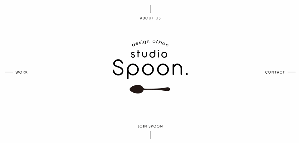 studio-spoon.co.jp
8. Frame around the site
A popular solution is not to stretch the site to fill the entire screen, but to place it in a neat frame. Cute and appears free space, which can be tailored for navigation (why not, since the hamburger menu is dying).
 teletype.online
9. More emoji
The less effort the user spends to react, the more willing he will be to do so. And they haven’t come up with any simpler reactions than emojis. For now, on websites you can only like content, the maximum is to give a Facebook Emote. But it's time to switch to emoji, fellow designers.
10. Material design
Yes, he is still with us.
11. More Mobile First
There are more and more users viewing websites from mobile phones - that’s why the approach Mobile First every year it is more easily accepted by clients. It is no longer considered a strange experiment, but a method that justifies itself. So get ready for an avalanche of sites of the same type, but so convenient for mobile phones.
12. More micro-interactions
Sites will absorb more chips from mobile applications. In 2017, there will be amazing micro-interactions that will make your fingers shiver. Like a heart on Twitter - well, it’s a work of art! I want to press him forever. There will be more of this in Mobile First and classic projects.
13. CTAs are even more intrusive
The designer stirs up beauty for beauty’s sake only on the table and on Dribbble. In other cases (in those for which money is paid), marketers are breathing heavily in his ear, who need something brighter here and a bigger button there. It seems that in 2016 there was a turning point and a rethinking of these requirements - expect big, juicy, eye-catching CTA blocks in 2017. Such that marketers have nothing to add to them.
 strv.com
14. Nostalgia for the 80s
On the refined Internet, designers miss match-head lamp pixels, the eight-bit sound of set-top boxes and the noise of tube TVs. And they compensate for their longing for the 80s and 90s in website design. Be on trend - add acidic colors, interference and glitches to your projects.
 retrominder.tv
15. Avoiding stock photos
Stock images have already set the teeth on edge, seriously. The hamburger menu is worse, and it’s easier to replace them. So let's film ours.
The 21st century is in the yard, kamon. Phones are like what they do high quality photos. Therefore, it’s not a problem to film employees or the work process right now on your phone. The main thing is time and desire to make a good project.
16. Greens
The guys from Pantone believe that the color of 2017 is this little green Greenery. Let's listen and add it to our list. 
17. A New Approach to Prototyping
Whatever wonderful design you draw, the main thing is to present it in such a way that the client falls in love. Or at least saw it as you see it.
A static layout can barely cope with this task, so in 2017 you need to improve your presentation skills. So that immediately, before layout, the customer sees all the invented pew-pews, and does not imagine them in his mind. Otherwise, he will imagine something wrong for himself, creating expectations that the developers will not be able to justify.
Now it’s not comme il faut for a designer to simply draw and show a picture. You need to be able to handle either one of the prototyping tools to create an interactive template, or improve your animation skills.
Here is your arsenal for the coming year, colleagues. But don't squabble with a customer who wants a videophone. Don't shove pixel elements and emojis where you need clean, minimalistic e-commerce. And don’t bombard reluctant clients on Skype with links to this article. Use trends wisely - or don't use them at all. Anyway, in three years they will be completely updated :)